Rate of Sales Analysis
Access
Available to Admin and Theater users. Theater users see only their own productions.
Navigation: Analysis > Select shows > Run Analysis (Rate of Sales)
What It Shows
Rate of Sales analysis answers the question: "Given the historical sales pattern of shows Y, how does the current show X compare, and what revenue might I expect through the end of the run?"
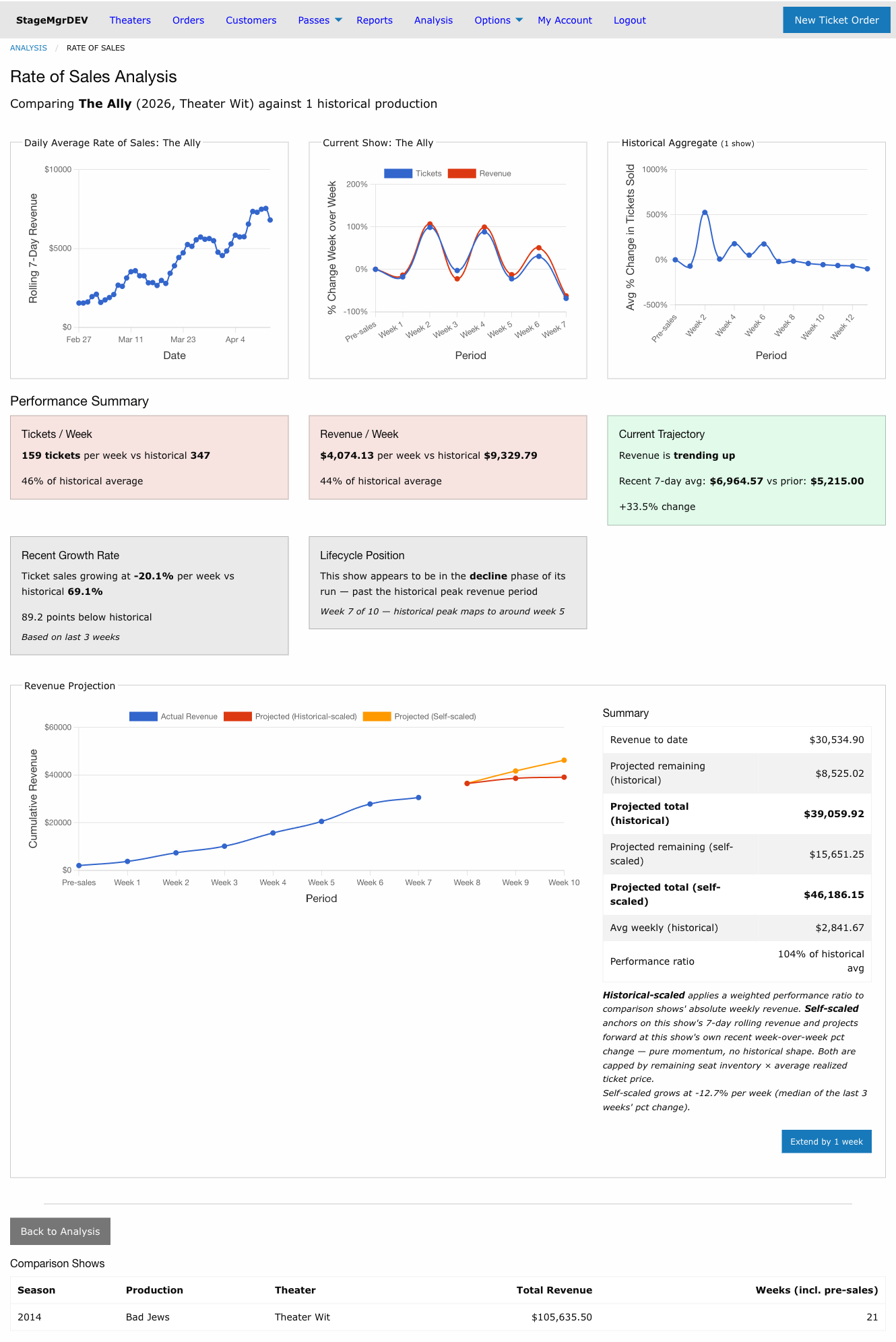
The analysis page has five sections:
- Daily Average Rate of Sales
- Rate of Sales Charts
- Performance Summary
- Revenue Projection
- Comparison Shows Table
Revenue figure consistency
The gross revenue shown here is the same total cash figure used by the Production Sales By Performance report and the Ticket Revenue Analysis screen. Rate of Sales stores daily snapshots keyed on the order's creation date, and those snapshots are refreshed by a scheduled background job — the analysis screen itself never recomputes on page load.
- Intraday — an "intraday" run fires every 30 minutes and updates today's snapshot so same-day sales show up within half an hour.
- Nightly — the full nightly run fires at 00:30 and recomputes the prior 30 days, so any refund or exchange applied to an order within that window self-heals into the snapshot the following night. Drift on orders older than 30 days stays frozen (Rate of Sales is used for velocity, not cumulative reconciliation — use the Production Sales By Performance report for an as-of-now cash figure).
If you need the snapshot refreshed immediately after a large refund, an administrator
can trigger RateOfSalesJob.perform from the Rails console.
Daily Average Rate of Sales
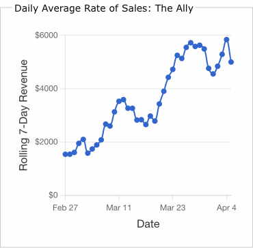
A daily line chart showing the rolling 7-day sum of gross revenue for the current show. Each point on the chart represents the total gross sales for that day plus the previous 6 days.
- X-axis -- Calendar dates from the start of Week 1 through the most recent completed day
- Y-axis -- Rolling 7-day revenue in dollars
This chart provides a higher-resolution view of revenue momentum than the weekly charts. Look for:
- Sustained upward trends indicating growing audience demand
- Dips followed by recovery which may correspond to mid-week lulls vs weekend surges
- Flattening or declining curves suggesting the show may be entering a plateau or decline phase
Reading the Ramp-Up
The first few data points will appear lower because the rolling window extends before the start of the sales period (those earlier days count as $0). The chart naturally ramps up as the full 7-day window fills with actual sales data.
Rate of Sales Charts
Two side-by-side line charts showing week-over-week percentage change in sales.
Current Show Chart
Displays two lines:
- Tickets -- Percentage change in paid tickets sold, week over week
- Revenue -- Percentage change in gross revenue, week over week
The current incomplete week is excluded to avoid showing partial data.
Historical Aggregate Chart
Displays a single line showing the average week-over-week percentage change in ticket sales across all selected comparison shows. Weeks where a comparison production had zero sales are excluded from the average.
Week Numbering
Both charts use normalized week labels:
| Label | Period |
|---|---|
| Pre-sales | All sales more than 3 weeks before first preview (collapsed to one point) |
| Week 1 | 21-15 days before first preview |
| Week 2 | 14-8 days before first preview |
| Week 3 | 7-1 days before first preview |
| Week 4+ | First preview week onward, sequential through end of run |
This normalization lets you compare shows with different start dates and run lengths on the same scale.
How to Read the Charts
- Positive values mean sales increased from the previous week.
- Negative values mean sales decreased.
- A value of 0% means sales were flat compared to the prior week.
Compare the shape of the current show's curve against the historical aggregate. If the current show's line is consistently above the aggregate, sales are growing faster than history. If below, sales are lagging.
Early Week Spikes
The first few weeks often show very large percentage changes (e.g., 500%) because the base numbers are small. A jump from 5 tickets to 30 tickets is a 500% increase but may only represent $750. Focus on weeks 3+ for meaningful trend comparison.
Performance Summary
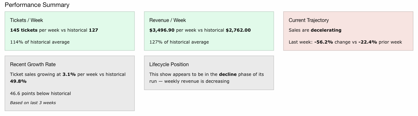
Six computed metrics comparing the current show to the historical baseline. Each metric is displayed in a color-coded card:
- Green -- 110% or more of historical average (outperforming)
- Yellow -- 90-110% of historical average (tracking normally)
- Red -- Below 90% of historical average (underperforming)
Tickets / Week
Average paid tickets sold per week for the current show vs the historical average over the same weeks. Shows the ratio as a percentage of historical.
Revenue / Week
Average gross revenue per week for the current show vs the historical average. Shows the ratio as a percentage of historical.
Current Trajectory
Whether revenue is trending up, trending down, or holding steady based on the daily rolling 7-day revenue data. Compares the average rolling revenue over the last 7 days against the prior 7 days. Shows both averages as dollar amounts and the percentage change between them. Requires at least 14 days of sales data to appear.
Recent Growth Rate
Average week-over-week percentage change in ticket sales over the last 3 completed weeks for both the current show and the historical aggregate. Uses only recent weeks to avoid early-run spikes that make full-run averages misleading.
Lifecycle Position
Estimates whether the show is currently in:
- Growth -- Historically, shows at this point in their run are still building revenue
- Plateau -- The show is near the point where historical shows reached peak revenue
- Decline -- The show is past the historical peak revenue period
Based on mapping the current show's position (week N of M) against where historical comparison shows peaked. Shows the mapped peak week for reference.
Revenue Projection
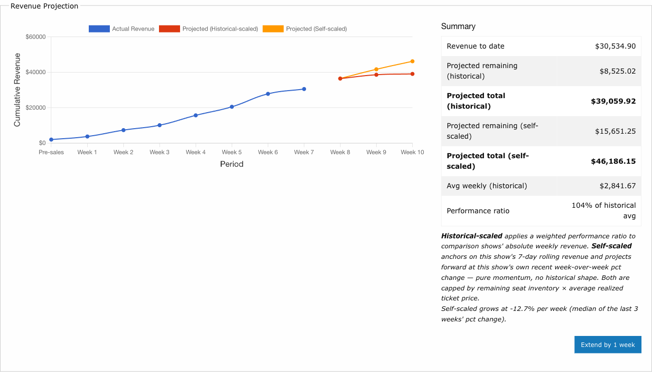
A cumulative revenue chart with three lines:
- Actual Revenue -- Cumulative gross revenue through the last completed week
- Projected (Historical-scaled) -- Estimated cumulative revenue through end of run, shaped by the comparison shows' lifecycle curve
- Projected (Self-scaled) -- Estimated cumulative revenue through end of run, driven entirely by the current show's own recent growth rate
The two projection lines answer different questions. Historical-scaled asks "If this show follows the comparison shows' lifecycle pattern, where does it end up?" Self-scaled asks "If this show keeps growing at its current rate, where does it end up?" The gap between them indicates how much of the forecast depends on the historical pattern being a good match.
Historical-scaled Projection
Uses a scaled historical pattern model with lifecycle curve fitting:
-
Performance ratio: Compares the current show's weekly revenue to the historical aggregate's weekly revenue, with recent weeks weighted more heavily (exponential decay factor of 0.7).
-
Lifecycle curve: The historical aggregate's revenue curve is split into two phases:
- Body (growth + plateau) -- detected dynamically as everything up to and including the peak week
-
Decline tail -- the sustained decline from after the peak through end of run
-
Curve stretching: The body phase is stretched to fill the projected run length. The decline tail is appended at the end. Extensions stretch only the decline tail, so already-projected weeks keep their values when you extend.
-
Revenue calculation: Each projected week's revenue = interpolated historical value at that position in the curve, multiplied by the performance ratio.
Self-scaled (Momentum) Projection
Uses a pure momentum model based on the current show's own sales:
-
Anchor: The most recent rolling 7-day revenue for the current show. This matches the value shown on the Daily Average Rate of Sales chart and is more stable than a single weekly bucket.
-
Momentum rate: The median week-over-week percentage change in revenue across the current show's last three completed weeks. Median (not mean) is used so a single early-run spike does not dominate the projection. The rate is clamped to ±25% per week for safety.
-
Revenue calculation: Each projected week = prior week × (1 + momentum rate). If the show has been growing at 8% per week, the projection keeps growing at 8% per week. If it has been flat, the projection stays flat.
The self-scaled line ignores the comparison shows entirely. It will project continued growth when the current show is trending up, and gentle decline when the trend is down, regardless of how the comparison shows behaved.
Seat Inventory Cap
Both projections are capped by the current show's remaining seat inventory to prevent implausible revenue totals. The cap is calculated as:
Remaining seats (across all future performances) × average realized ticket price (from sales to date).
When a projected week would imply selling more revenue than is physically possible, the week is clipped to the remaining budget and subsequent weeks stay at zero. The help text under the chart notes when any week has been capped.
Summary Table
| Metric | Description |
|---|---|
| Revenue to date | Actual cumulative gross revenue through last completed week |
| Projected remaining (historical) | Historical-scaled estimate for all remaining weeks |
| Projected total (historical) | Revenue to date + historical-scaled projected remaining |
| Projected remaining (self-scaled) | Momentum-based estimate for all remaining weeks |
| Projected total (self-scaled) | Revenue to date + self-scaled projected remaining |
| Avg weekly (historical) | Historical-scaled remaining divided by number of projected weeks |
| Performance ratio | Current show's revenue as a percentage of historical average |
The help text below the table reports the momentum rate that drives the self-scaled line (for example, "Self-scaled grows at +4.2% per week (median of the last 3 weeks' pct change)").
Run Extensions
The Extend by 1 week button models what happens if the run is extended beyond its scheduled closing date. Each click adds one week to the projection and recalculates both projections.
When extending:
- The historical-scaled projection stretches its decline tail to cover the added weeks; already-projected weeks keep their values.
- The self-scaled projection adds one more compounding step at the momentum rate.
- Both projections remain capped by remaining seat inventory.
- The Extended by N weeks label shows how many weeks have been added.
- Click Reset to return to the original run length.
Reading the Two Lines
When the historical-scaled and self-scaled lines agree, the current show is tracking the comparison pattern closely and either projection is a reasonable forecast. When they diverge sharply, the current show is behaving differently than the comparison set -- use the self-scaled line as a momentum-only sanity check and look at the Lifecycle Position and Current Trajectory cards to understand why.
Extension Modeling
Use extensions to evaluate whether adding weeks to a run is likely to generate meaningful additional revenue. If each additional week projects declining returns under both models, it may not justify the additional costs. Compare the projected average weekly revenue against your weekly operating costs to make the decision.
Comparison Shows Table
Lists all selected comparison shows with:
| Column | Description |
|---|---|
| Season | The season year |
| Production | Show name |
| Theater | Producing company |
| Total Revenue | Total gross revenue across the entire sales lifecycle (including pre-sales) |
| Weeks (incl. pre-sales) | Number of weeks with sales data, including the pre-preview period |
The Back to Analysis button above this table returns to the selection page with all current and comparison show selections preserved, so you can adjust and re-run.